-
AuthorPosts
-
January 2nd, 2017 at 12:14 #41635
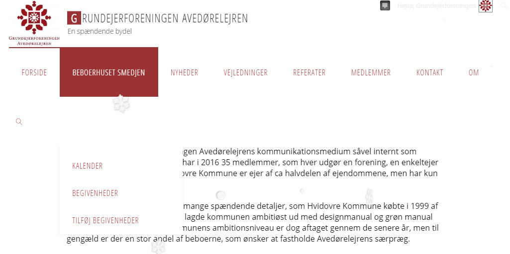
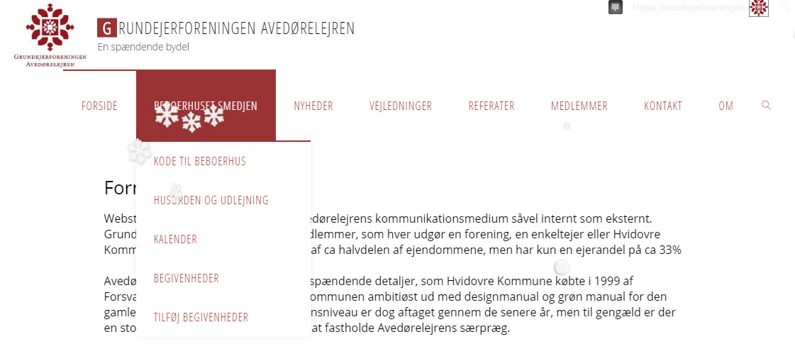
I noticed that some of my dropdown items disappears when my browser isn’t in full screen.
Same thing happens when showing site on iPad or any other tablet in landscape mode.If window isn’t wide enough to hold all top-menu items (ie the last ones drops to next line) the drop down items gets invisible/hidden behind the second line of the top menu.
Please take a look at my site – when in smaller window mode – point to BEBOERHUSET SMEDJEN.
Then notice that the 2 first items in the drop down is missing.Website: avedorelejren.dk
January 5th, 2017 at 17:10 #41724Still not working after last upgrade
January 12th, 2017 at 22:16 #41899Isn’t any other suffering from this problem?
January 13th, 2017 at 09:53 #41913The results can be seen here
NOT Working:

Working:
 January 13th, 2017 at 20:00 #41927
Zed
Cryout Creations mastermindThe menu is problematic if there are too many items and they extend beyond one row.
Due to the complexity of the header (4 general layouts, 2 menu behaviours and 3 alignment options) there’s no easy solution for this yet. The workaround for now is to limit the number of items to make the menu fit in one line (at least on the target screen size and larger).
If you like our creations, help us share by rating them on WordPress.org.
Please check the available documentation and search the forums before starting a topic.January 13th, 2017 at 20:59 #41945Isn’t it possible to revert to mobile layout when the menu line extends to 2 lines – or at least let the selected option be in front of other options
January 15th, 2017 at 07:53 #41983Norelico
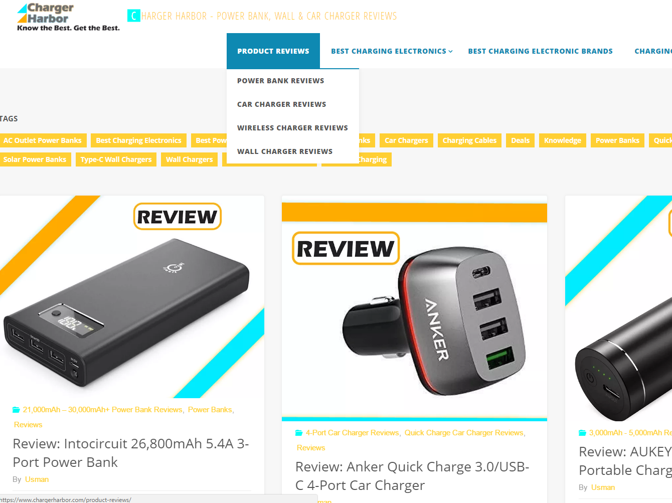
Power UserYup. Having the same problem here.
Check it out.
Working:

Not Working:

Would reverting back to an older version of Fluida fix this?
Website: www.chargerharbor.com
-
AuthorPosts
The topic ‘Menu dropdown isn't working on smaller window size’ is closed to new replies.
