Our themes include a special way of defining presentation page columns contents. This method allows for an infinite number of columns (and improved support for multi-language plugins).
The theme comes with 6 sample columns when no content is yet set. These 6 columns will disappear once you start adding your own content.
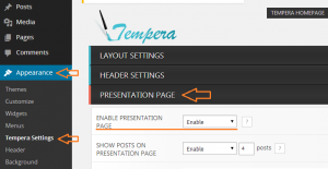
To get started, navigate to theme’s settings page, eg. Appearance > [Theme] Settings.
Open the Presentation Page section to see all its options (make sure the presentation page itself is enabled if you intend to use the slider and/or columns). Scroll down to the Presentation Page Columns group of options.
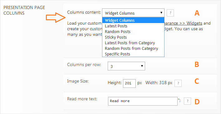
A. The first (and most important) option is choosing the source for the columns content:
- manually defined content – Widget Columns
- automatically generated from:
- latest posts from all categories
- random posts from all categories
- sticky posts from all categories
- latest posts from a category
- random posts from a category
- specific posts or pages (by IDs)
B. Defines the number of columns per row the theme should display. Add the right number of columns so they correctly divide to the value you set here. Also make sure your content fits if you set a large number of columns per row.
C. Lets you set the height of the column image. The width is dependent on the total theme width and the number of columns per row, so this is automatically computed. Use these numbers when you create and upload your column images.
D. Defines the column button text.
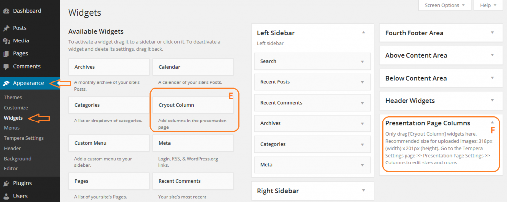
Navigate to Appearance > Widgets.
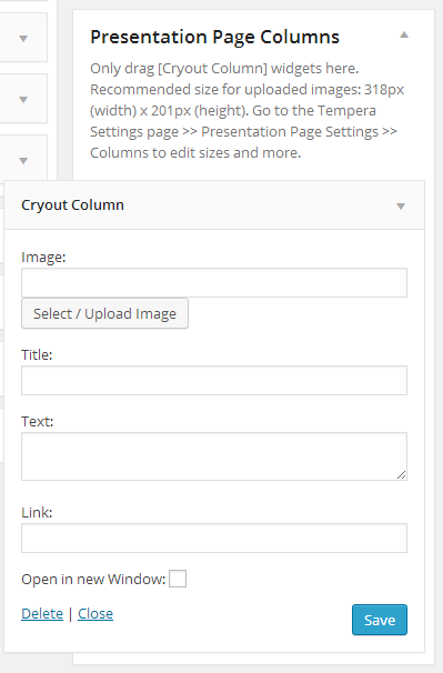
Note the Cryout Column (E) widget and the Presentation Page Columns (F) widget area.
Drag and drop a Cryout Column widget to the Presentation Page Columns widget area. This will open up the widgets field so you can start adding content to your first column.
- Column image URL – type in manually or select image from the Library. Respect the suggested image size or your columns will look distorted.
- Column title – enter column title or leave blank to hide
- Column text – enter column text or leave blank to hide
- Column link – enter link columns sends to on lick or leave blank to disable
- Check box to open the link in a new window/tab.
When done click Save and your new column should become visible on the frontend.
To make sure your posts are valid for columns content, check that the selected posts:
- have a featured image set; the image should be correct size as set in the Columns settings (or larger so that WordPress can generate the needed crops)
- have a title (if you wish them to display a title)
- have content (if you wish the content to be displayed as column text)
The columns will link to the posts themselves. There is currently no way to define custom links.
Note: These instructions apply to Tempera, Nirvana and Parabola (since v1.7).

Using the cryout columns widgets on the presentation page and the content does not display in widescreen. And yet it’s fine when viewed on a mobile. content disappears as browser size gets larger. Odd
Doh! Scrub that last comment. The content is supposed to appear inside the image when you hover over it.
For the sake of clarity please allow me to refer to the “widget columns” as gollywimples and refer to columns in the more conventional sense suck as columns of text or columns in a table.
Is it possible to add more than four columns to the “presentation page columns” area? Specifically i would like to place more than four gollywimples in a horizontal row the magic number being six gollywimples in a/each horizontal row.
Is there a means of accomplishing this simply or does it require custom coding?
Having more than 4 “gollywimples” in a row requires code changes to the file rendering the presentation page. I’ll take a look at this and send you the file via support. But note the 6 will not be change-able 😉
TY Zed. I knew it was best to consult a certified expert in the field of gollywimplery!
If you send me the snip to achieve 6 Gollywimples per row I should be able to change it in the future after seeing how the default and the patch are constructed side by side. If not I need a good kicking and will be sure to post a “good kicking” thread in the forum 🙂
BY “support” are you meaning on an open ticket or will I see this in the E-mail?
Hi i know how to configure cryouts widget columns. I have done it before. But when i updated the theme and wordpress to the current versions, i dont know why i am unable to add/see more than one image on the presentation page after that. Please help. I need the cryouts on my homepage back. My website is http://www.awdr.com.au
Make sure all your extensions are updated and compatible with the latest WordPress. You could also look for JavaScript issues in your dashboard (press F12 in Chrome or Firefox to open the webdev tools).
Love this theme and have been using it extensively.
How much work would be involved in either allowing a site to have multiple presentation pages, or to allow the cryout column widgets on other pages?
A current site I’m working on is using a presentation page as the home page, but I have a products page where I would love to use the cryout widget for each respective product (and as a link to that product’s page).
What are your thoughts? And thank you.
Multiple presentation pages… not an easy task. Cryout columns outside the presentation page is doable, but you’ll need a bunch of CSS for them to work.
Hi:
how can I disable curtain effect in cryout columns?
Thans in advance
Due nobody can answer this question, I solved this isue using special columns “Text/HTML”. This widget is so powerfull.
Thanks all.
Antonio Fernández from Valencia (Spain)
The “Text” widget is the holy grail of WordPress 🙂
Having troubles adding cryouts. I was able to figure them out before and they appeared so perfectly. But when i deactivated and reactivated the theme, all the cryouts i had are saved but i am unable to add them all, not more than one. I am not given an option of rank 1,2, 3, … So i disabled it for a while until it’s fixed.
And one more thing, the same things happens when i add widgets on all sidebar locations.
I think there’s something bugs on the widgets page.
The widgets page is part of WordPress, and if you are unable to drag-drop items on that page then you need to look for JavaScript issues in your dashboard.
Great Setup! By far the easiest to use and navigate. I do have a problem with the customized cryout widgets and I’m not sure what I can do about it. In the presentation page, I have set them to 3 rows across” and when I save and visit the page, they are all in a vertical line. SOS!
Hi. As you can see, your messages were not deleted (they were just awaiting moderation).
You are no longer using the columns on your site, so I cannot see the issue. Could you enable them back?
This is a great theme, thank you. I am having an issue on the presentation page where I am using columns for posts. The feature photo comes up and when I hover it greys over but I think there should be the first 50 words of text there as a teaser but it’s just showing blank. Can anyone tell me what is causing this? Thanks.
I see they have captions now. Did you solve this?
Is there any way to have more than 4 columns on the presentation page? Really need it. I’m willing to donate if helped.
If you’re asking about Tempera, you can have any number of columns. If you’re asking about Parabola or Mantra, the number of columns is limited at up to 4. Adding more needs a lot of code changes.
Hi all
Great theme, but is there a way to use the Cryout Widgets in a 3*2 layout on a DIFFERENT page than the presentation page? Like a portfolio page..?
So far I’ve been able to add them in “below content” or “above content” widget area on the standard template, but that always shows them as whole width and each additional one below the previous.
Cheers, Susanne
The cryout columns widgets are only supposed to be used on the presentation page and are not supported anywhere else.
Could you all please fix the calendar code? Every time I update, I have to go back in there and fix it myself. Thank you.
Could you show us the issue?
Amazing theme. One question: in the presentation page, although I will select one column per row, the theme will load two posts per row. Am I missing something?
Tempera always uses a two-columns layout for listing posts on the presentation page. This is a design choice and is not configurable.
I got a problem on the presentation page in the middle of the slide and the widgets how can I insert a page with two columns, please reply 🙁
I read through all the comment threads here and didn’t see an answer to my question…so here goes. How (more accurately – WHERE) do I go to edit the LEAVE A REPLY area in the comment form? I can edit it when I view the inspect element tool panel on the site…unfortunately I cannot find it in the stylesheet or in the comment.php or theme comment.php file…After a few hours of this…I’m coming to the source…H E L P…many thanks in advance for your assistance
I love this template, well done. Is there a way to add text underneath the images in the columns, I have three columns each displaying image with read more, but would also like to put a paragraph under each of these in each column?
This is not possible without editing theme files.
Coming back to my problem (that the presentation page columns are not showing x per row, but only ONE per row): Firefox, Opera and Google Chrome show one column per row, even if I have correctly chosen (in the Settings) 3 per row.
BUT MS Internet Explorer show the results as wanted, that is, 3 per row.
Any idea of what is causing this and how to correct it so that it is shown correctly on all other browsers, too? Thanks!
Problem solved. As soon as I have removed a post that was appearing on the presentation page below the columns, they started to appear correctly, i.e. 3 per row.
AND:the hint “read more” at the column bottom is NOT showing up. Thanks!
Sounds like you’re having some javascript issues. Check with your browser’s web dev tools.
Zed, the theme is excellent. However, I´m experiencing a problem with the columns.Even if I have chosen “3 columns per row”, the widget contents are being shown as “1 column per row”, that is, for (at the moment) e widgets, I see them in 3 different rows. Any idea of why this is happening?Thanks!
I just do not understand how to (a) create a dedicated page that is (b) linked a column. Click the column widget, bring me to new page. It’s basic, I’m sure, but I just can’t figure this out. Please help.
I do not understand what you mean by “linked to a column”. A column of what? where?
Hi,
I’m using the latest Tempera Theme and I’m wondering how it’s possible to translate the fields of the presentation page into different languages with WPML.
Specially I’m trying to translate the upper titlte and text from EXTRAS-Section.
Any help is appreciated.
Thx
Stef
As far as I know WPML cannot translate the theme’s presentation page. One plugin that can translate the presentation page is qTranslate.
Hi, excellent theme!
I have one problem — I’m using the columns for displaying random posts from one category, and I have more than enough posts for the columns always to be populated. What happens though is that I have never seen all ‘cells’ (from my standard 3×2, 6 elements setup) populated with content. My idea was to have one single row (3 elements), but it always picks up less than the necessary. Sometimes one, sometimes 2, sometimes even 4, but never 6. And when I had it configured to use 3 posts, it would never render all three.
As I see it, as long as I have enough material, these should all be filled with content, right?
Thanks
Gus
BTW you can check it out at http://www.vocari.com.br
Thanks!
Do all the posts you are trying to display have featured images set (of the correct size)?
Cryout column is not showing after wp-admin logout..
if i logged in its showing my selected images after logged out old (default) theme images.
Thanks
Check that you are not using a caching plugin.
Sarò ancora più chiaro. come rendere visibili i contenuti delle sidebar anche nella presentation page?
Grazie
I can not put two side columns, one right and one left, from the slideshow to use as banner ads. Do you think you can?
thanks
The presentation page does not display sidebars. The presentation page is meant for presentation, not general content (where sidebars are included).
I like your theme. Any way to make the columns percentage instead of px? When I have it show on a really wide screen, it has a gap between the main column and the right column (or left, etc). Thanks.
The content, sidebar(s) and total width are (configurable) fixed size. You cannot turn these to relative (percentage) widths without rewriting the whole theme.
Hi all!! How can I change the text of the cryout column button?
(now it’s currently set to “read more”)
Thanks a lot!!!
btw, AMAZING theme!!! I love it!
Found it!!! sorry 😛
Hi mate. Would you mind sharing this valuable info with me if it suits you? Thanks.
I found it too sorry 😀
Hey guys,
I’m liking the tempera theme, but have an issue. I tried to remove the comments section from the posts and pages through the theme settings, but to no avail.
When I tried to find a way to do that in the php files, I ended up with this, “Fatal error: Cannot redeclare tempera_comments_off() (previously declared in /home/content/53/5647753/html/wordpress/wp-content/themes/tempera/includes/theme-comments.php:142) in /home/content/53/5647753/html/wordpress/wp-content/themes/tempera/includes/theme-comments.php on line 85”.
I tried to go back and revert the change, but I’m stuck. Everything I click jumps to a blank page with that same message. Even the test site pages have that message. I tried to reload the theme and start from scratch, but I can’t even do that. Can you guys help with this?
Delete and resinstall a fresh copy of the theme. Never edit theme files if you don’t know what you are doing. Then read this for the comments. http://www.cryoutcreations.eu/wordpress-themes/wordpress-tutorials/wordpress-disable-comments-tutorial
Never mind, just found how to do that (using the cryout column and applying it to the presentation page columns) THANKS!
Hi, thanks for this great template. Is there a way I can show only media on this columns. For ex: I upload an image and I want to show that image only (or a group of images). Please help.
The image is the only required field for the columns. You can leave the title, text and link fields empty and they will not be displayed/used.
Is there a way to leave the 3 fields empty and have the image serve as the “button” to be clicked on for a link? Thanks! (great theme btw…)
Not without editing the theme.
Also, fyi, I had to apply this custom CSS:
table#wp-calendar th {text-align: center !important;
}
to get the days of the week to center align the same way as the numerical dates are.
Interestingly enough, columns is just what I came to talk to you about.
Yesterday, I enabled your theme on a site I’m building, RealisticCompassionism.com, and I love it. I intended to just use it to test something and troubleshoot twenty fourteen — but nothing doing because Tempera is da bomb.
However, I noticed on the Presentation Page (homepage), in the columns, the blockquote is broken. It doesn’t indent properly, which results in the large black quote image overlaying the blockquoted text.
Any thoughts about what CSS add to fix it?
Other than that, it’s wonderful!
P.S. Unrelated: Is there any way this or another theme can both be responsive and fluid? I.e., full page width that adjusts to the size of the browser, but still does all that responsive mojo on a mobile device?
The blockquote issue is fixed in the upcoming 0.9.7 update.
A theme needs to be created with fluidity from start, and Tempera was not built to be fluid.
No worries, Zed. It’s a great theme.
If and when you produce a fluid responsive theme, I’d be interested in that also.
Hello everyone,
Could you help me how to change the font size of the text of Presentation Page Columns? Maybe it is a really easy one but I really couldn’t find it. Thanks in advance