Yes, Tempera has finally entered beta state and is ready for download. We’ve just submitted it to the WordPress repository where it’s waiting for the review process to commence. Until then you can download it from here and we’re counting on you guys to give it a try and let us know what you like and what you don’t like about it, what works and what doesn’t, what is and what shouldn’t be, what could but may not, what must but could never… you get the idea.
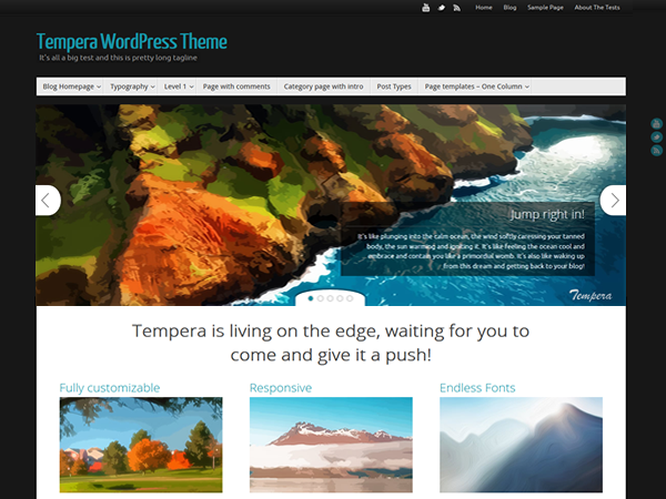
Tempera’s design is in some ways the opposite of Parabola, leaving behind the mathematical, well defined and contained layout and going for a more artistic design with many shadows, round corners and even some asymmetry here and there. It also embraces CSS3 in its entirety and takes full advantage of transitions, so subtle animations are present at every corner.
The theme settings are still there, giving you the creative freedom you’ve come to expect from our WordPress themes and, as usual, we’ve taken things a step further.
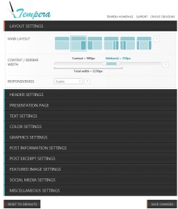
The biggest change is probably the infinite number of columns you can now use on your presentation page. Just like with the slider, you can choose to use posts for loading content in your columns and all the options are there as well: latest posts, random posts, latest from category etc. But you can also choose to load (an infinite number of) widgets as column content. Feel free to give that a try and don’t forget to come back here and give us some feedback.
Post information settings have separate options now: for single posts and for posts shown on blog, category or archive pages so for example you can choose to show the Author and Date on single posts but only show the category on the blog posts. We’ve moved all the comment settings in this category as well. We’ve also added icon fonts to these post metas and these are icons that you can change the color of 😉
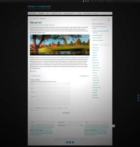
You may also notice a new top bar in Tempera that you can choose to show, hide or even make fixed, meaning it will stay visible at the top of the page as you scroll down. For now you can add a menu and social icons to it but we have plans for more.
There are a few more things you’ll notice like the fact that comments now use placeholders so there’s no more space wasted and everything fits better, that you now have the option of where to show you post information metas (just under the title or after the post content), that some border and shadow colors are calculated automatically based on your input background color.
One thing some of you will also notice is the lack of Color Schemes. Since the theme is still in beta we’ve decided (just like we did with Parabola) to wait till the theme is 100% stable color and option wise to implement them. So Color Schemes will be present in version 1.0.
From now on everything is in your hands: the dice have been thrown, the ball is in your court and we’re just gonna wait for the fat lady to sing. Until then, the Tempera page is up, the Tempera forums are up, the Tempera demo page is also up and here’s the download link again in case you missed it.
Have fun and play nice!
Hello, first time on WordPress. TX! for Tempera, very nice template. I have two problems with the Main Menu Bar. I hope you can help ?
1) how to get same color in the sub-menu and in the main menu when the mouse goes hover ? By now, only sub-menu color change (and there is a slight change of the transparency of the main menu which appears, but remain same color, which is not ergonomic, we miss there is a page linked in the main menu…) . Any advice for it ?
2) After having change the size of the header image from height 120 to 240px, and back to 120px, there is now a space which appears on top and on bottom of the menu bar (which is 38 px). It was nicest before. This area should be 158 instead of 168px. Please, how do I change ?
Thank you very much for your help
Hi is there a way to embed videos, YouTube videos on that? Thanks
This is part of WordPress functionality – https://codex.wordpress.org/Embeds
Not sure how to embed onto the presentation page? I am having a hard time with that. How can I make that happen?
I love the colors in the slider and would like to look for more of the same..what do you call them? Pastels..or? Has the RSS issue above been fixed? That is a huge part of what I am looking to do..Thanks…
How do I change the header colour? (Site title)
I’m having a new issue with my theme. I downloaded some plug-ins on my website, and after this happened, my theme colours all changed. The background used to be black, now it is white, the social media icons are now white, not green (all the colours that are still saved in my tempera theme settings). The menu bar at the top has also changed – it no longer looks the same. Any ideas? Thanks very much.
Hi,
Using Tempera theme, and just find that widgets are not allowed to get motion in it.
I’ve tried several RSS feeds aggregator, that scroll news, and when they are set up to scroll, the plugin doesn’t work.
Tempera would be even more nice if this is fixed… 😉
Thank’s
Strange the slider page does not work. It was running perfect for 1 week and the it stops working… I dont understand… it says page not found… I have only had one thing plugin activated
Is “Your homepage displays” set to “your latest posts” under Appearance > Reading ?
I love this theme! Thanks!
Quick question – at the bottom of my homepage there is a link to #1 and #2. When you click on #2, it goes to the same homepage, but with ‘page/2’ at the end of the address. I’m wondering how to get rid of both of those numbers. Any ideas?
Thanks so much!
The pagination on the frontpage currently has some issues in Tempera. We’ll get this fixed in the next update.
Thanks, Zed!
I was a Mantra fan, which I used for the first website I put together. Tempera is even better! I have just one question. I’m using a Post Category called News as one of my Menus, and I’d like to know how I can make the posts start with the most recent at the top?
I’ve activated the magazine layout, but it seems to insist on putting the earliest posts at the top, when I’d prefer it reversed.
Thanks
Lucy
Sorting posts by date descending (newest first) is actually the default sort mode in WordPress.
I don’t know how you managed to change this. Are you using any plugin that affects this order?
How can I edit the home page? I can create pages and posts and edit them, but can’t find the page where the slides are, so that I can change its contents. I don’t mean changing those 5 images. That was easy, I mean editing the text in the main page.below the slides. Thanks.
If you’re referring to the presentation page columns contents, what you see is sample content. It will automatically disappear when you start adding your own content. You can do this by switching columns content to be created from posts (this is found in the theme settings page) or by adding the specific Cryout Column widget(s) to the Cryout Columns widget areas.
Hi, can i change the size of font-size of the columns headers?
thanks 🙂
For now you need to use custom CSS:
.column-header-image { font-size: __px; }how can i use slider in all page
and how can i use cryout column in other pages
There is only one presentation page (slider & columns) and it can only be enabled as the homepage.
Ok Ok..its ok
Beautiful! : )
I am new to this and don’t know how to edit (replace) the six images on the 6 columns that originally came with “Tempera”. Also, I don’t know how to enter the text. Can anybody tell me how? Thank you.
The theme comes with default columns content when no content is yet set.
The columns are configurable right below the slides, with “Presentation Page Columns”. There you set the number of columns per row and set their source (and you can also see the suggested image size which you will need later). If set to “Widget columns” (custom columns), the content is controlled via Widgets.
Go to Appearance > Widgets and drag the “Cryout Column” widget to the “Presentation Page Columns” widget area. This will allow you to define the column widget title, description, image and target URL. Leaving the title, text or URL empty will hide these fields. The image is required (also make sure it is the correct size).
How do i create a black border for my website?
What area do you want to add the black border around to?
Ok, I’ll let you know 😉
Very nice Theme, is it Ok to remove the footer link? Do you want a donation for this? 🙂
Kind regards
Oli
Hi there!
I reported a bug here http://www.cryoutcreations.eu/forums/t/clicking-save-changes-goes-to-page-not-found-doesnt-save-changes but it seems you guys missed it. Please take a look at it 😉
Thanks!
We can’t really test the dashboard side of things on your site. Check your permalink settings (or your .htaccess file) for errors.
Very nice theme. Great !
Just one thing i cannot figure, how to show the full post on presentation page. The post is being half cut on the content. Or am i doing somethig wrong.
Disable post excerpts for category pages (under Post Excerpt Settings in theme settings)
Loving this theme. Thinking about deploying it full time (blog.lanierchambersingers.org). One thing that I would like is the ability to move the header menu to the left of the social media links, rather than the right. Another helpful option I’ve noticed in a plugin is to be able to excerpt posts based on sentences (i.e. periods) rather than words.
I’m not sure if this is in the scope of your theme, but it would be great to be able right-align a single menu item (like we have at lanierchambersingers.org).
I’ve been using Tempera for a few days now and still love it. Thank you! I hope to make a donation for lots more coffee soon. 🙂
I’ve been using Parabola for a few months now and decided to go back to Mantra. But then I saw Tempera. Guys, I’m downloading and installing it right now. If it’s been build like Mantra and Parabola, it wil be great to work with!
Hi guys, I am now using Mantra for my school’s website (www.semipalar.sch.id). I have been using it for several months now and it is really great. Your new theme Tempera is amazing! It is definitely stylish and really cool. would certainly use it for more formal content. I will be looking into it to see if it can be customised to reflect the spirit of our school. Great jobs guys. Really!
thanks for your beautiful theme
but theme Top Navigation isn’t rtl and still is ltr
can you help me to fix it
thanks
There’s actually an option under Graphics Settings called Menu Alignment. You can use that to right align the menu.
Hell yeah! Guys, you did it again. Been using Parabola for many months, and I just love it. Now I see Tempera and, wow, it’s just great! Of course I’m gonna give it a try 🙂
Nice, I was on Parabola. Tempera ist so same and so different! Just finishing new site. Congratulations!
Hi, Can anyone help me how to remove footer link from the site of parabola.
Thanks
See questions A1 to A4 in the FAQs.
Hell yeah, I’ll give it a go! Looks sweet. I really love Parabola, so I’m interested in seeing what you did here.