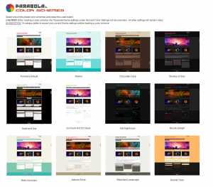
Our latest WordPress theme, Parabola, has finally reached version 1.0. Apart from increasing stability and greatly improving responsiveness, this version also introduces 12 preset color schemes. You can now switch between 12 different looks for your site with just one mouse click. Go check them out then come back and give us some feedback.
In the meanwhile here’s the changelog:
- added colour schemes support and 12 built-in colour schemes: default, skyline, chocolate cake, shades of gray, night and day, so fresh and so clean, mid nightmare, bloody delight, retro icecream, autumn rose, bleached landscape and basket case
- changed site description styling to be covered by the caps disable option
- added two new font sizes for content and menu for better compatibility with fonts
- fixed main menu (sub)-sub-menu font-size to be relative to configured font size
- removed default background colour for site description
- updated translation files with the new strings
- add the first Parabola translation – Italian (thanks to Mirko Milani)
- presentation page column images should no longer enlarge on mobile devices
- fixed (yet another) header responsiveness issue
- fixed a compatibility issue with NextGen Gallery plugin
- styled the <!–more–> and html excerpt continue reading links
- improved presentation page to handle empty title and image column fields
- improved featured image as header image functionality to display the correctly sized image in the header
- improved dashboard jQuery check


Hi i like the theme so much, is there a way to use it in my web? can you please check it out anyhow i will download it, thank you in advanced!!!
www generandoideas com
http://wordpress.org/themes/parabola
Hi Guys,
Beautiful theme! I was just curious if there is a way to add more of the text/photo boxes to the front page. I’d like to have more like 9 instead of 3 (what a lovely 3 they are though!).
Thanks!
Jenny
There is currently no way to easily add more than the maximum 4 columns.
Is there ANY way now? I really need it!
Hi
Is there a way to make the color options for the columns on the presentation page different from the content color options on the rest of the pages?
Sarah
Yes, by using custom CSS on the different areas making up the presentation page.
Hi!
Why if I change the Design I lose all the changes I made to the presentation page? I had 2 sidebars one column and if I change back to just 1 column every change I made is lost (color scheme, pictures I uploaded to the slider, etc).
Also, is there a way to place an image in the side bar, but a different one for each page?
Thank you very much!
Hi,
Thank you for this theme. I may be using it for a WordPress website I am making, but have some issues that need to be fixed, before I can make it definite. Could you help me on these issues:
– lay out in browsers like Internet Explorer, Firefox, Safari and Google Chrome is not the same. Also, if you make the screen smaller, the site stays the same width. So you miss a part of the site. How can I fix this?
– I have a corner logo plugin that works fine on alle pages, exept the front/presentation page. How can I make it working on the front page?
Hope you can help me!
Kind regards.
El
Great theme! It’s so not blog-like Love that!
Questions:
Is there any way to “align-center” navigation menu?
Any chance to stop the slider after one or two full loops?
Any possibility to add sliders to posts and pages other than presentation page?
I would be really thankful if you answer
And thanks a lot for this great theme.
1.
#access .menu { margin: 0 auto; display: table; }2. not easy
3. you can use any slider plugin for that.
A great looking template.
But i’ve lost my side bar completely (some talk of jQuery issues?!)
Help?
Do you have widgets set to be displayed in your sidebar?
Where (in the parabola theme)can I add HTML to the section? I cannot edit the file in html to add code. I want to create a different background for several pages using something like: http://www.css3.info/preview/multiple-backgrounds/
Although I have disabled uppercase transformation, this still persists in the menu in mobile view.
Thanks for pointing it out. We got it fixed in 1.0.2
Hello! Thank you for the great themes! I like them very much. I have 2 small issue.
Is there a premium support in Russian?
How to make links “About” and “Contact” above the icons of social networks, like the Parabola demo in the top right corner of the header?
Thank you!
Premium support is only available in English.
“About” and “Contact” are part of the top menu (assignable in Appearance > Menus > Menu Locations)
Hi guys,
Thanks for this new theme – it has everything I was looking for, the ability to create a rich look and feel yet easy to customize and play around with. I was a big fan of the Mantra theme as well, but I think I like this one better.
Any chance of creating a “feature boxes” shortcode type thing? Like where we can add a call to action button or pricing table? I’ve been looking for a reasonably priced (I’m raising a teenager, so that’s where my money goes;-) theme or even a plugin and the ones I have found are extremely buggy (i.e. full of bugs) and don’t work well.
Thanks!
Hi there,
I am having major issues with getting a color scheme to “stick” to my site. No matter what scheme I choose, it simply won’t change from the default “white” background, purple and blue links. Am I doing something wrong? I don’t really understand what the problem is.
Thanks!
There is no default white background, purple and blue links. Parabola’s default default scheme has orange links.
Looking at your website URL, it looks just fine. Do you still have this issue?
I have the exact same problem… any one find a fix?
I’m having the same issue, but now my header is gone on the home page, but appears on the other pages on the site.
Hey Parabola Team,
Awesome work! But any chances of expanding the total width? Need it bad bad badly.
You’ll really need to be a little more specific than that. I’m not sure what you’re talking about.
Hi Kay, what I meant was the total width.
For now it is 1050px, which consists of content 800px, sidebar 250px.
How do I make the total width to 1150px?
I need more space horizontally.
Another thing, my sub navigation menu font size appears 1px size smaller than the parent navigation menu. Before I updated to Parabola 1.0, it was 1px size bigger! How do I make the font sizes the same?
Thanks.
Hi Anna!
In the Mantra Settings page you have Layout Settings. There you have a slider where you can select the widths you want.
Also if you want the sub-menus the same font-size as the menus paste this in the Custom CSS area:
#access ul ul ul a {font-size:14px !important;}
You can replace that 14px value with whatever value you have selected for the menu font-size.
Perfect,
I am literally crying out of joy!
Love your team, thank you!
How do I use it for my wordpress blog
You should ask the guys at wordpress.com to include Parabola in their repository. We’ll ask them as well
I’ve changed the default all Caps option, to the newer Upper Case/and lower case option. It works on most of the site except for the Tagline is still in all Caps. I really don’t like it that way. I’ve changed to several different fonts to try to fix this problem but still does it even in Arial. Is there a setting i need to change? I love this Theme!!!! Great job guys. Bambi
I see you fixed the issue, you were probably using an older version of Parabola. In version 1.0 this should work.
I’m helping a friend set up a website using Parabola, but am unable to get the site title to display as Camel Case. I updated to the 1.3.0 version of the template, but am still unable to affect the site title case. Changing the site-description to lower case works fine, by the way. Something I’m missing?
Any advice anyone can provide would be appreciated.
Try a different font. Some fonts only support uppercase.
I found a bug I think. When I change color schemes initially, it works. I can keep changing color schemes with no problem, and the site renders just fine. However, when I switch back to Parabola default, I lose ALL my theme settings and it switches everything back to default including the settings and the color scheme. Please fix this. Great work guys!
Thanks a lot for the feedback. The issue is fixed and it will be available in the next theme update.
my posts dont seem to display the pictures even when i correct them from the settings. i did check all my graphics settings, post settings and post expert settings. is there anything else im missing.
Could you be a little more specific? How and what do you correct from the settings?
Also, make sure your twitter/facebook links don’t start with the # that’s in there by default since that will make the links not work.
Great template! I really like using it for my website. Also really like the alternate font/text options this latest release offers
I had some issues where my featured image replaced the header image on a few pages. Removing the featured image fixed the problem, but re-adding it in put it back onto my header. I can’t figure out why it is doing this so I left the featured image off on a few pages. Any idea what could be causing this?
Any way to increase text size for widgets in footer area? I am using the “so fresh so clean” font setting
Thanks again for the great template!
Michael
You must have mistakenly enabled the “Featured image as header image” option under “Featured Image Settings”. You shouldn’t enable options without checking out what they do (or at least reading the hint)
Right….thanks, I don’t know how I missed that one
Keep up the good work!
Michael
Has anyone noticed whether Parabola has been having display issues in certain browsers? I designed my site with Parabola and on my computer using Google Chrome, it looks perfect. I’ve viewed it in practically every other major browser and it has display issues. Any thoughts?
Aside a slight font rendering between Safari and all other browsers (which all render the same), I see no difference.
Could you post some example screenshots of what you see in different browsers?
Zed- Yes, I will try at least. I’m not sure if they allow image attachments here.
How you have viewed the site in your browsers is how it should be. The standard Parabola appearance, minus the color adjustments and background pattern.
A few web browsers, IE10, Safari, and even a friend using Google Chrome (which is what I’m using) have seen the site have a white background with a blue header. It looked nothing like my site. Let me see if I can get a photo in here somehow. I apologize, I’m not a techy by any stretch. I’m learning as I go with this.
Chris