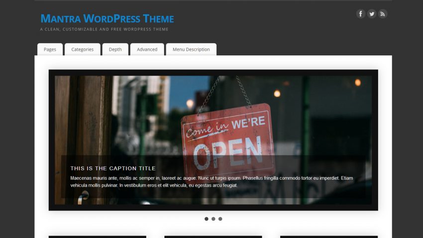
Another update keeping up with the trend started in v2.3.0 which means more cosmetic changes. We’ve altered the comments’ layout yet again, slightly updated the sticky posts and author info boxes and revamped the post metas. Let us know in the comments what you think about the new cosmetic updates.
This version also fixes the search form, recently broken in v2.3.0, and we once again altered input fields. A new Steam icon has been added to the social media collection and the auto-redirect to the theme’s settings page after theme install / update has been removed (new WordPress regulations). We hope new users will still find their way to the settings page because even with the redirect active some people missed it completely.
Changelog:
- added Steam social icon
- disabled auto-redirect to theme’s settings page after install (requested by WordPress)
- some cosmetic changes (multi-page pages/posts pagination, stikcy posts, post metas and author info)
- restored comments boxed styling
- fixes search form broken in 2.3.0


Hi,
I signed up for Premium Support – but cannot seem to get an answer to a question I have.
I would like to be able to change the color of the footer message text by css or remove the message.
Thanks for any help.
Did you use our premium support form? The email you wrote this comment with is not present in our support system.
Hi. I would love if we could center-align the heading of widgets when the sidebar is on the left side
You can use a bit of custom CSS for this:
#primary .widget-title { text-align: center; }But this will always apply to the first sidebar in the template, no matter which side it is on.
Would it be possible to specify the files that were modified in the change log? I’m using a child theme of Mantra, so it would be helpful to know what files were changed in an update. Thanks!
The most complete history is in the theme Trac. You can compare any two versions between them for a complete list of changes.
Right now the only thing I don’t like about Mantra is that the site title/tagline use the “general” font. The post/page title or header font would be better (or one of its own).
Noted. We’ll give that some thought. Thanks for the feedback.
I’d like to add a “me too” to Shannon’s request 🙂
Yikes! I just updated to 2.3.1 and my Social Media icons have all shrunk in size. I thought that meant I could add more, but no. I checked the actual image files and they haven’t changed. Where can I update the stylesheet to restore them to their previous size until the next update when they’ll hopefully be restored?
Thanks!
Hmm, it looks like smaller icons were part of version 2.3.0. Since this appears to be a permanent change, I’l guess have to reconsider their placement. Right now, they look a bit funny (proportionally) in their current location. If there would happen to be a future option to let us choose icon size that would be VERY useful.
Cheers!
Hi John, long time since we last spoke.
It seems that we forgot to check how the socials look when used in sidebars. We’ll bring the socials to their old size when used in the sidebars in the next theme version.
Thanks for the feedback.
Thank you, comments look now beatiful… but just my ideas:
1) add border around the group of comment (nested comments) – comment and its replies
http://www.cryoutcreations.eu/forums/t/comments-add-border
Because replies and comments are not separated, it is difficult to read it and find it
2) add pointer-hand for comment form send button
http://www.cryoutcreations.eu/forums/t/cursor-pointer-for-submit-button-in-comment-form
3) maybe social buttons from parabola theme – left/right possition etc… but it is not priority
BTW – if you can send me css code for first idea it would be great…
1)
ol.commentlist li.comment { padding-right: 5px; }ol.commentlist > li { box-shadow: 0 0 2px #ccc; }
You can use border instead of box-shadow, but box-shadow is less heavy on the eye.
2)
#respond .form-submit input#submit { cursor: pointer; }Thank you…. about first point – it is not working for me:(
I am sorry, it is working! My mistake in css code… thank you really much!
I’d still like to see an option in the “Post Information” settings for adding a “last updated” date around the “Post Date” settings.
We’ll consider adding this in the future.