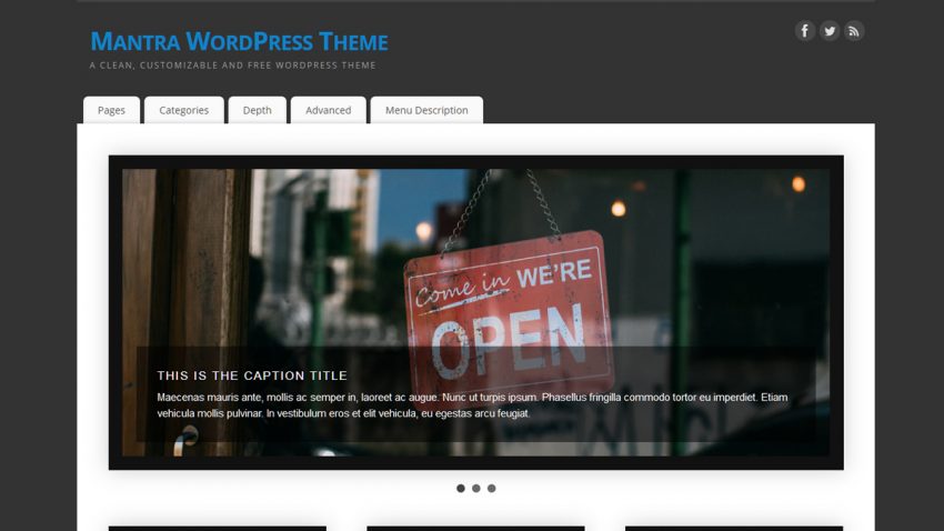
Mantra is all grown up now. The latest 2.1 update brings a cosmetic update of the settings page, together with quite a few other general fixes and improvements. Responsiveness, performance and ease of use have all been polished for a better all-round user experience.
And here’s the complete changelog:
- cosmetic update of the admin interface; sub-section settings should be easier to spot now
- updated NivoSlider (fixes a double-load of the frontpage which may increase site loading time)
- fixed the <!–more–> tag functionality on blog page template (reported by Olrik)
- added header image Keep aspect ratio option for responsiveness
- fixed Featured image as header image functionality to display the correctly sized image in the header (reported by Fulco)
- fixed mobile menu not working with automatically generated menus
- fixed mobile icon responsiveness on Safari for mobile
- fixed sticky posts padding on Magazine layout and mobile
- fixed unordered lists bullet image positioning
- top and bottom menus now only show the top level elements (sub-menus are not displayed)
- fixed small issue with the search-bar on Chrome
- improved dashboard jQuery functionality check


Can we please get a hamburger menu option for the mobile menu? My dropdown is scaring people away
Love the theme – just updated to WP 3.6.1 and the menus no longer drop down
What version of Mantra are you using?
Hi Zed
I’ve just discovered your templates and have begun using the Mantra theme on one of my blogs, I love it!
Hi,
I was pleasantly surprised to read my name in you changelog above, because you did a fix on the header images dimensions settings, after my post on that issue in the forum.
Meanwhile I entered a new post, since I don’t get what I am doing wrong with my (rather large) images. Despite the fix you did, some pic’s still are not displayed as neat as I would like them to appear.
Please look into that post as well and leave a reply.
Keep up the good work…..
Fulco
Hii,
I was wondering how I can remove the ‘continue reading’ arrow? Thanks!
Hey guys,
I am wondering how to get rid of the white dotted line separating my main column from the column bar on the right side. Is there a way to do this is the Mantra settings? Thanks a bunch
There’s no option for that, but you can use custom CSS:
#primary, #secondary { border: 0; }perfect! Thank you
THANK YOU!!!
I like Mantra very much. Thank you for such good product!
But I have a question. How can my mobile users switch on a full version? There’s no any buttons or links. And I don’t know how I can do them.
For example, I prefer full version of my site when I see it on smartphone. But I can’t switch it on if Responsiveness is enable. So I can’t use Responsiveness at all. Help me, please!
Hi,
There is a slight problem with the Dutch translation. Normally Mantra displays the ‘Continue reading’ button with the dutch text ‘Meer’, but it is now English ‘Continue Reading’.
Will this be fixed?
The ‘Continue Reading’ text is editable via the theme options (Post Excerpt Settings >> Continue reading link text ).
Thank you!
Also, Would it be possible to update the Social Media Icons in Mantra? They look really old school, while they look so much more modern in Parabola.
Maybe one could say the user could do it himself with the proper sized images he wishes to use, but still, a more contemporary design for default would be welcome, I believe.
Adding a custom icon upload for the socials is something that we’ve been planning to do for some time now. We still can’t give you an estimate of when that will happen because customizable options have a tendency to go wrong if not used properly and we want to prevent that.
What we can tell you is that we will update the current icons for version 2.2.
Which one would you recommend for speed and lightness, Parabola or Mantra?
Mantra of course is probably more mature, but lightness is advertised as Parabola theme’s asset.
For maximum performance which one should one pick between the two?
Personally, I’d recommend Parabola.
Mantra still has a couple of options that need improvement, but keeping backwards compatibility is preventing us from making radical changes.
Chink in the armour? Breadcrumbs text size is VERY SMALL !! Increasing it to content text size will be helpful !! 🙂
Thanks for the feedback. That will be fixed in the next theme version. Until then you can add this code to the custom CSS area:
.breadcrumbs {font-size:1em;}
Hi Zed
I cant think of words to express how I felt on upgrading the Mantra theme. All I can say is, THANK YOU !!! :’)