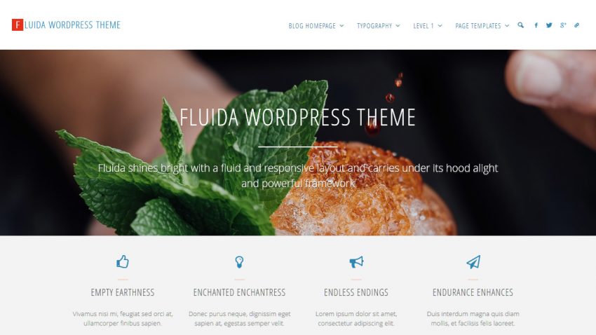
Three months and 500 queued themes later, Fluida is nearing the end of the review line and will soon enter the door into WordPress’ Theme Review virtual offices. What awaits her there – nobody knows…
However, to prepare for this, we’ve gathered up a fresh set of features and fixes in Fluida’s backpack.
Changelog:
0.9.3.1
- Fixed responsive featured image inconsistency between browsers
- Corrected fixed menu alignment issue with the new left/centre layouts
0.9.3
- Added menu text colour option
- Fixed sidebar background colour missing on mobile devices
- Fixed breadcrumbs alignment issue on mobile devices
- Further extended layout alignment options with Left (not contained) and Center (not contained) options
- Improved mobile menu to follow configured colour options
- Fixed article alignment in masonry enabled pages
- Fixed theme recommended Google fonts not loading extra weights
- Added auto-detection of RSS link in social icons
- Improved form elements styling outside the main content area
- Fix icons rotation effect glitch on some browsers


You’ve said that until Fluida is in WordPress officially, we’d have to install it manually. Can you explain in simple terms how I (a non-coder) would do that? I really like the look of this theme!
We have that covered in our theme installation tutorial.
Hi, I just updated the theme and now see a big space above the header. Any idea why? I can’t figure it out. Thank you!
http://www.kitchengadgetreview.com/