The Anima theme is Cryout Creations’ latest WordPress theme and it has just about everything our previous themes have accustomed you to, plus a few extra perks.
Anima Theme Features
It’s completely responsive, as you can see for yourselves in the demo. It’s also multi-purpose, seriously, try and find a field or domain you couldn’t use Anima for. It has almost unlimited customization capabilities, varying from colour and typography options to layout and widths to socials and featured images. It has both wide and boxed layouts, which pretty much means it’s two themes in one. Anima is also search engine optimized as its using microformats as well as Schema.org microdata. What does that mean? Well it basically means that Google, and search engines in general, will love it. And of course our beloved Anima theme is translation ready and supports right-to-left languages.
Our Anima theme, being a true multi-purpose WordPress theme, also has two menus plus a mobile one, six dynamic widget areas, breadcrumbs, numbered pagination, back to top button, unlimited Google fonts, customizable meta information and excerpts. And everything can be enabled or disabled from the theme’s extensive customizer options.
Anima Landing Page
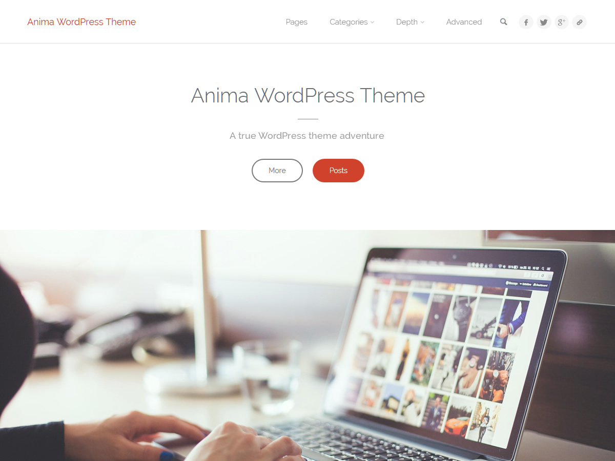
There’s also the landing page. It comes equipped with an ultralight and easy to use slider, featured icon blocks, featured image boxes and text areas complete with parallax effects.
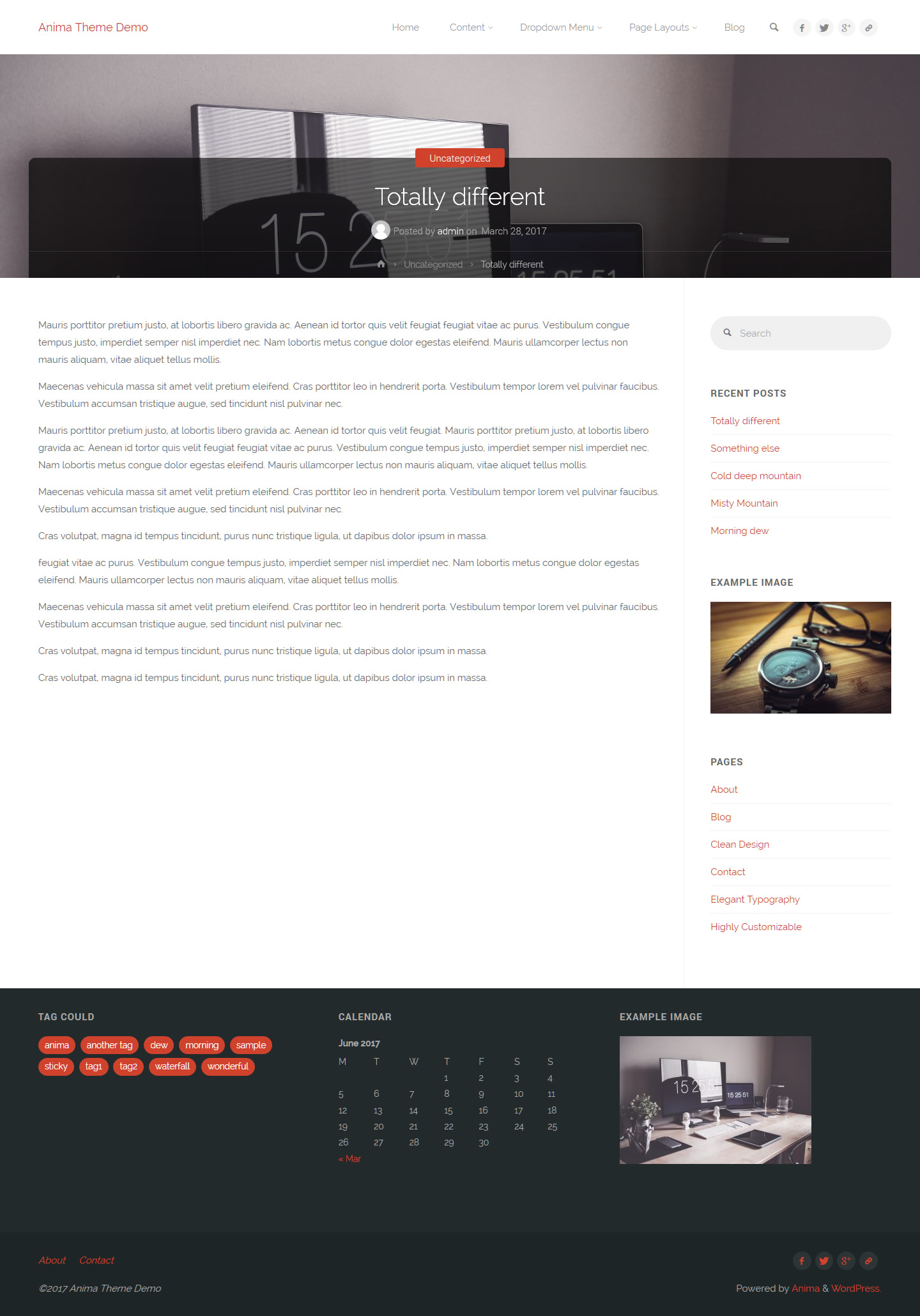
A nice little addition to the theme are the header titles accompanied by the post metas and breadcrumbs that appear over the header image. You can see how (awesome) it looks in the image below but for a better experience you should really check out the theme demo. Especially since you’ll miss out on the nice animations if you’re just going to look at the pretty pictures.
And before showcasing some theme beauty, here are all the useful links for Anima – a WordPress theme full of heart:
- Download (and semi-manual install instructions)
- Demo
- Forum


This theme looks very promising, but at the moment if I use my logo for the header (site header content>logo) then the navigation menu disappears.
Has anyone else encountered this situation and fixed it?
Your menu is most likely large enough to no longer fit in the available space when the logo is enabled (making it jump below). Try to re-arrange your menu items to make the top items shorter.
Hi,
I just discovered this theme, which seems to me very beautiful, just a detail, the last posts are not aligned.
I understand, not the same length of the title, of the excerpt.
I’m not a coder but I was thinking, there are 8 articles, not possible to have a setting by line (post-row)?
I explain
Line 1 posts 1 & 2
Line 2 posts 3 & 4
Line 3 posts 5 & 6
Line 4 posts 7 & 8
(Code taken on another theme)
post-row {

    margin-left: -30px;

    padding-left: 30px;

    float: left;

    width: 100%;

    border-bottom: 1px solid #eee;

    margin-bottom: 30px;

    position: relative;

}
Something like that for CSS, everything wouldn’t be better aligned ?
And put the entry-meta, that’s fine, but I see sites where the posts are in 5.6 categories, see more, so we will not see the image, it will be hidden by the entry-meta
Put between image and title, maybe better, just a personal opinion.
Really pretty nude theme good job
Thanks for this wonderful theme, very nice! I use it for my portfolio, it’s the best way to show my work. http://b-bertuleit.de/category/works/
Very nice theme. I like it. I want to change a theme on my website santabarbarahvaccontractor.com, please tell me, is an Anima configure without problems?
I like Anima a lot. The biggest thing I miss from the old theme settings (ala Nirvana, Parabola …) is the “Export settings” button. I suppose I can find them in a database table, but that button sure was handy.
The WordPress.org Theme Review Team considers settings handling to be plugin-like functionality and asked us to remove it from the themes.