-
AuthorPosts
-
November 29th, 2022 at 17:53 #134492
Hello,
I use the Esotera theme (v1.2.5.1).
I’m on wordpress 6.1.1.I think there’s a problem with the “gallery” block.
An example on this page where the firts pictures should be displayed in 4 columns, and then in 3 columns : https://lanthuriumasso.fr/nos-creations/Does anyone have the same problem ?
I have another website (6.1.1) but with the “Fluida” Theme and don’t have that problem.
Thank you for your help
Website: drive.google.com/file/d/12QucuonSlCpH8_O3nz-r91QGoXUQUtkr/view?usp=sharing
December 5th, 2022 at 11:35 #134638Having the same issue here with the Kahuna theme:
December 11th, 2022 at 16:17 #134899Zed
Cryout Creations mastermindHi,
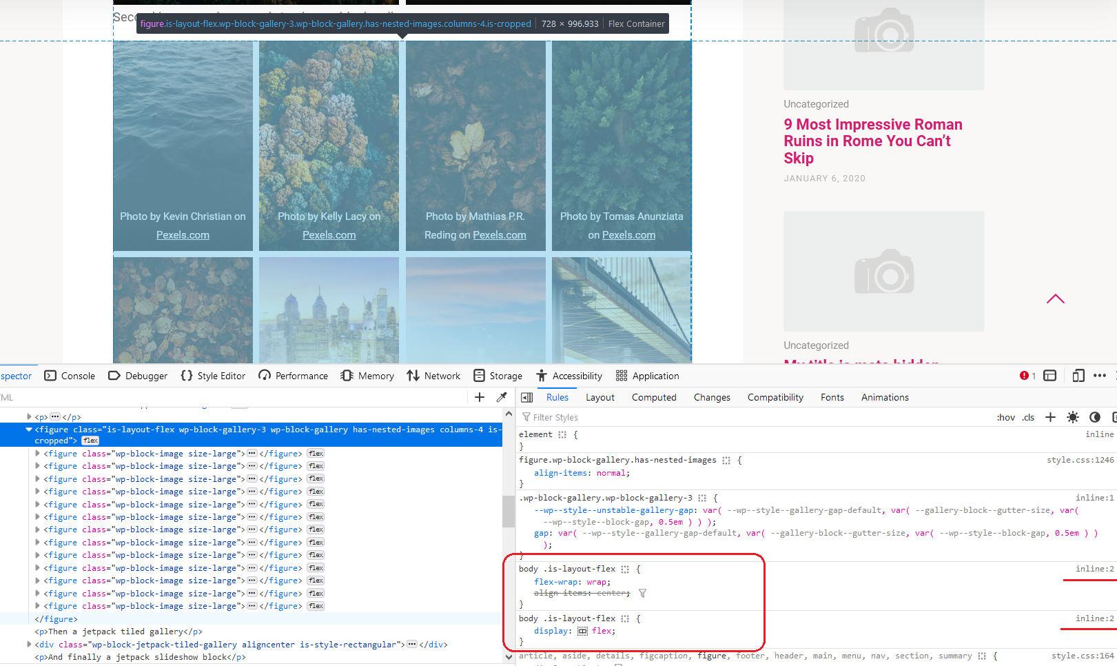
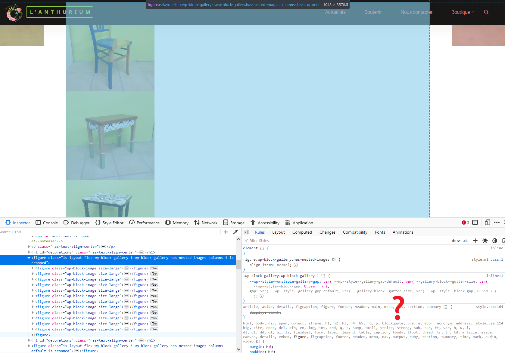
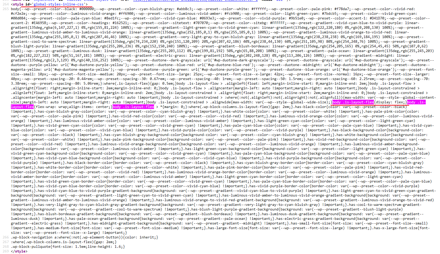
I cannot recreate this issue in Esotera on our test site (I didn’t check Kahuna). Comparing the markup and styling used by the galleries, I notice your sites are both missing some built-in WordPress styling that should be applied to the gallery elements (see screenshots below – first one is my test site, second and third are your sites, last image is the inline WordPress-generated styling from my test site that’s missing on yours).
I suggest temporarily switching to one of the default Twenty themes to check if the gallery works fine there. If it still doesn’t, look into any optimization plugins that may merge/minify the styling.
If you like our creations, help us share by rating them on WordPress.org.
Please check the available documentation and search the forums before starting a topic.December 13th, 2022 at 11:06 #134967Hi Zed,
Thanks for your answer.
It works fine with the Twenty Twenty One Theme, I forgot to told you that I did tried that.
How can I deactivate all my plugins without injuring my website ?December 13th, 2022 at 12:09 #134968Works fine in Twenty Twenty One here as well. It also used to work fine in Kahuna. I don’t have any optimisation plugins or anything that affects the styling, and disabling as many plugins as I can makes no difference.
December 22nd, 2022 at 12:01 #135198Jan
Power UserHello,
i have the same issue. On two completely different sites, different hosters.
One is has your Mantra-theme, the other has the Roseta theme.The Gallery block items are rather small, it should be possible to have 4 in a row. In edit-view, its displayed as desired, but in the public frontend, all gallery-images are displayed one below the other.
Website: stoebener-essen.de/last-minute-geschenke-fuer-weihnachten
January 13th, 2023 at 12:04 #135756Jan
Power UserAny ideas, how to fix this bug, @ cryout @zed ?
Here is another link to a post with a gallery; different website, different theme from cryout (Mantra), but the same issue.
The width of the gallery-container (?) seems to be something around 50% of the post-content-width.
February 6th, 2023 at 11:51 #136596Any chance this bug is going to be fixed? I can’t really use galleries any more!
Website: lofi-gaming.org.uk/diary/2023/01/squiggle-drop-ipad-completed
February 9th, 2023 at 13:09 #136659The best solution I’ve chosen is using a gallery extension until the problem is fixed 😉
February 27th, 2023 at 23:14 #137140Jan
Power UserI downgraded Roseta 1.3 to 1.2.2, which fixes the issue @Zed
It’s the same issue with several (all?) cryout themes: the bug was introduced in the latest version.
But, it is strange: On a new wordpress-site, on which I install the latest roseta for the first time, the gallery block works fine. So, the issue only occures on longer existing sites, which were updated.
-
AuthorPosts
The topic ‘Problem with Gallery Block’ is closed to new replies.


