-
AuthorPosts
-
April 18th, 2016 at 13:34 #36485
Helen Christmas
Hello again,
I have looked at my site on a samsung mini and the header image I have used doesn’t seem to adapt to fit the screen – it’s just chopped off at the sides. I am also having difficulty seeing the top main menu, are there any options available to tweak? I like the template so far – it’s very light and suits this site well on a desktop PC it is just the mobile view that’s a little out of kilter.
Any advice?April 25th, 2016 at 11:27 #36551Zed
Cryout Creations mastermindSwitch the header image’s responsiveness mode from the theme’s options (under Header).
What difficulties are you having seeing the main menu?
If you like our creations, help us share by rating them on WordPress.org.
Please check the available documentation and search the forums before starting a topic.April 28th, 2016 at 09:23 #36567Lars
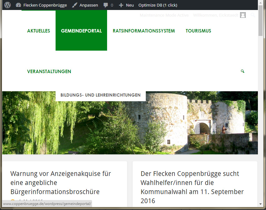
I also have a ‘problem’ with the mobile view on my iPad mini – the top menu switches to 2 rows and the second row overlays the first and it’s pulldown submenus, which are no longer visible and not selectable any more.
I see two solutions:
1) to switch to the mobile menu sooner – or make the ‘switchpoint’ editable.
2) to keep the top menu in one row until it switches to mobile menu.I’ve been looking through the style.css to find an entry to change the switch point between normal/mobile menu.
Can you help please?
May 16th, 2016 at 11:05 #36707Zed
Cryout Creations mastermindLars, could you provide a screenshot or a link to the site?
If you like our creations, help us share by rating them on WordPress.org.
Please check the available documentation and search the forums before starting a topic.May 18th, 2016 at 07:59 #36721Lars
Hi!
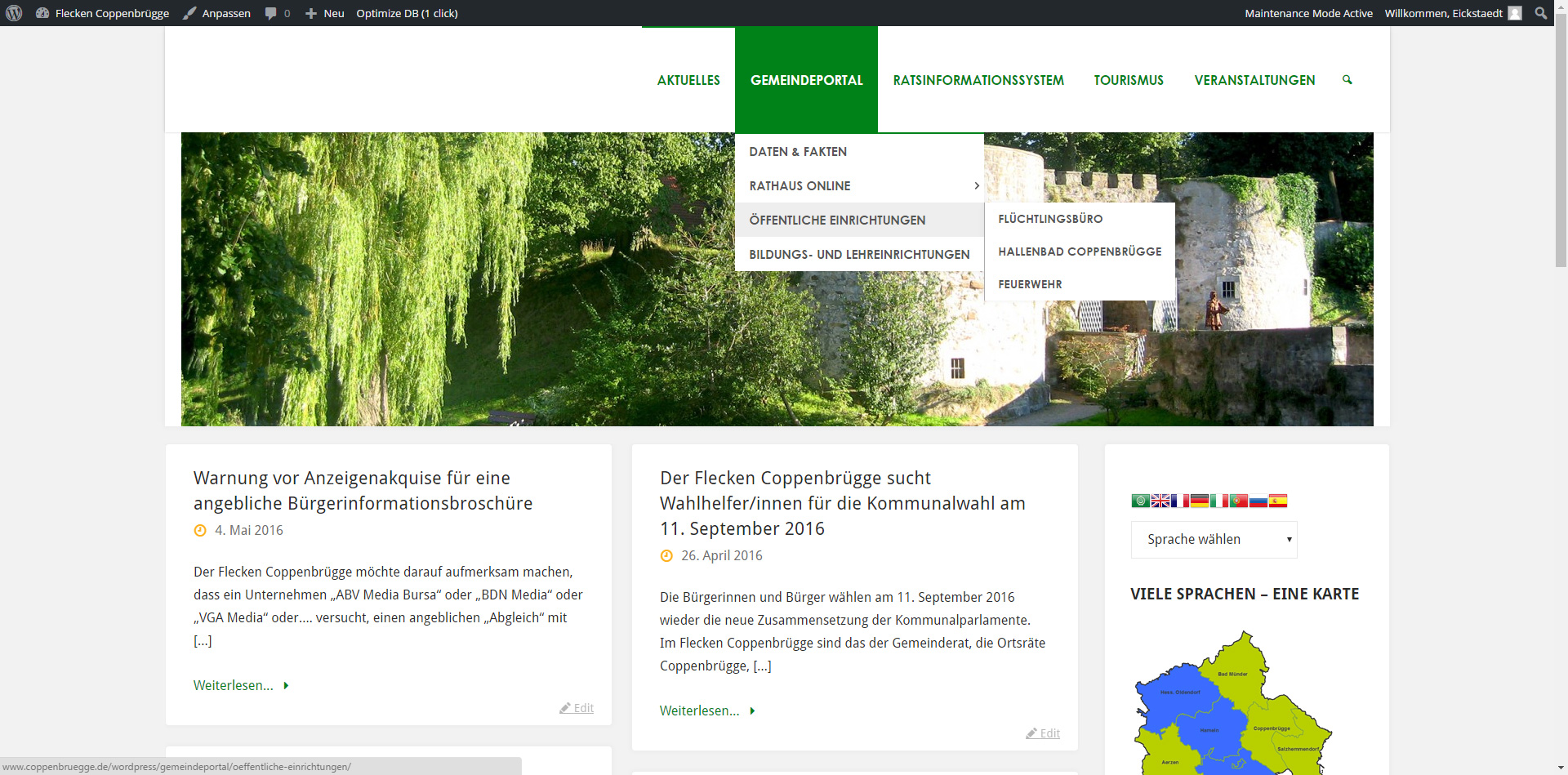
Here is the screenshot of the ‘full size’ with the working menu:

Here it’s broken into 2 rows – hiding the submenu:

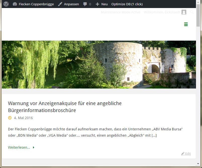
And finally the mobile menu – working fine:

The site is German 🙂
May 23rd, 2016 at 19:03 #36757Zed
Cryout Creations mastermindWe’ll look into this for the next update.
If you like our creations, help us share by rating them on WordPress.org.
Please check the available documentation and search the forums before starting a topic. -
AuthorPosts
The topic ‘Mobile View’ is closed to new replies.
