Thanks again, @Zed. The fixes you suggest above worked well. Hard to believe it was 1.5 years ago already… 😀
I have another styling question: I cannot find any settings for background (currently transparent) in the Main Menu in the Customizer. And also, the change of font (family and/or color) in that Main Menu via the Customizer is not showing any change when I attempt to bold the font or change fonts altogether. Do you have any input or how-to links to share with me about editing/changing the main menu? Thanks in advance!
I am curious if you found a resolution to this issue, TigerWolf.
My site is running on PHP v7.4. I tried to upgrade the version of PHP to v8.1 as my host requested, but when I do so, the site doesn’t work. Similarly, v.8.0 doesn’t work. My host is no longer supporting outdated PHP versions, so I am concerned. I love my current Nirvana template and would hate to switch.
Website: www.earlmacdonald.com
My site is running on PHP v7.4. I tried to upgrade the version of PHP to v8.1 as my host requested, but when I do so, the site doesn’t work. Similarly, v.8.0 doesn’t work. Is this a bug within the Nirvana template? My host is no longer supporting outdated PHP versions, so what should I do? I love the current template and would hate to switch.
I created a footer with elementor and applied it for the site. When its applied the whole header disapears. If I disable it the whole header comes back.
How can I enable my elementor footer and keeping de basic header?
Hello,
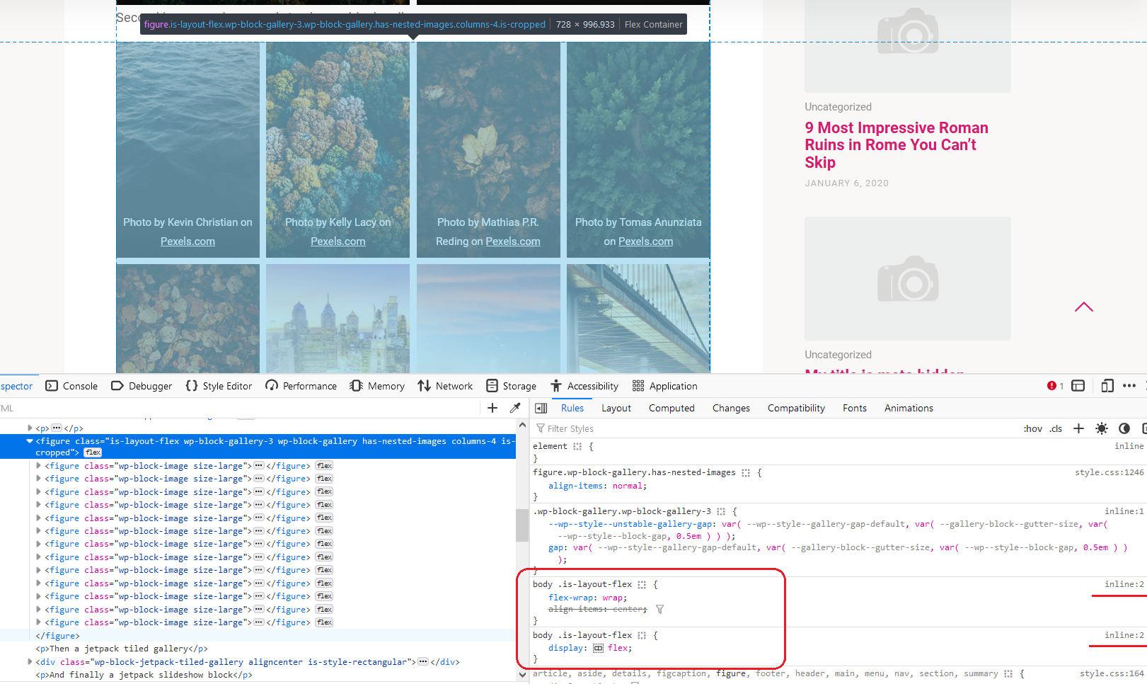
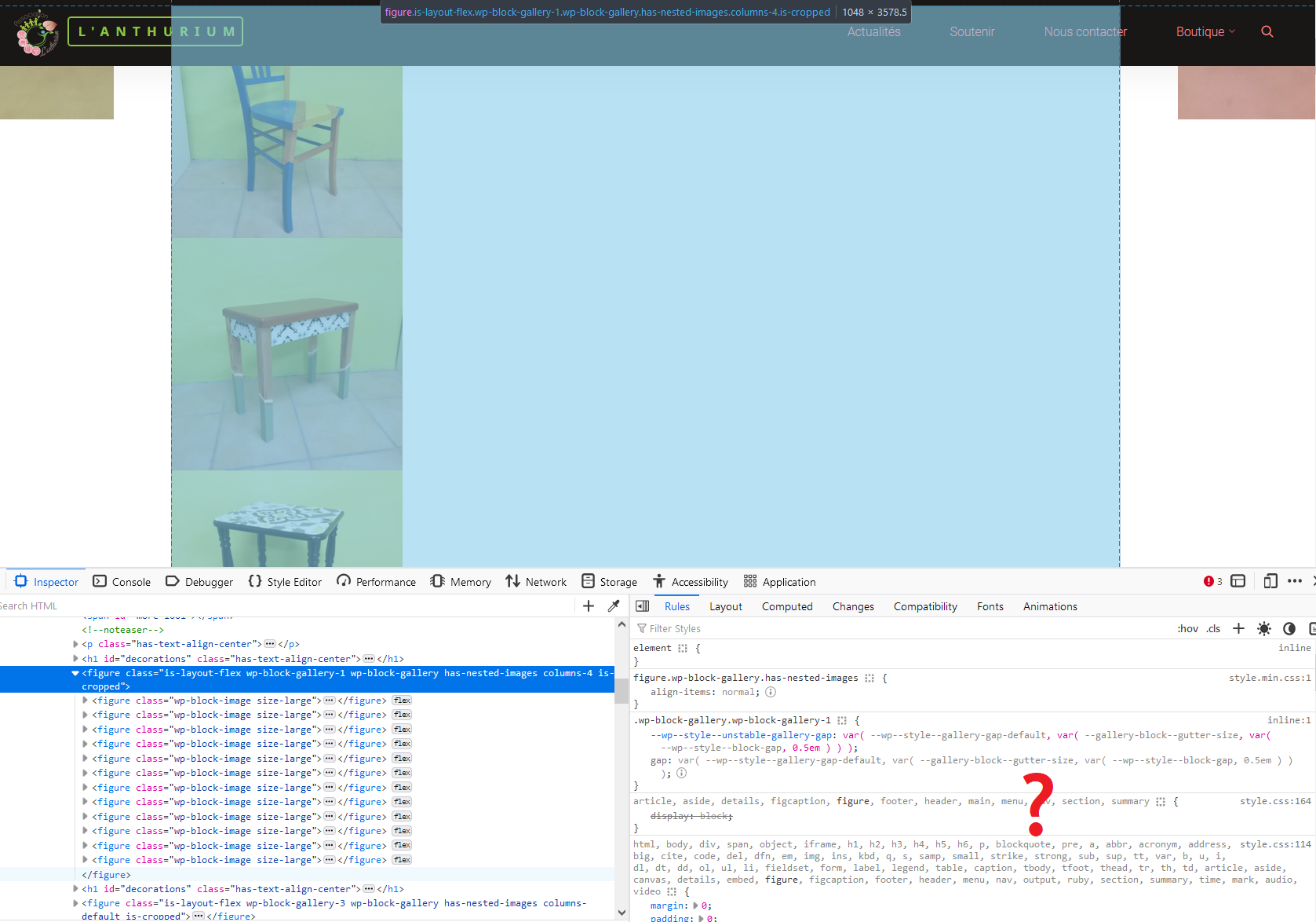
the display of the Gutenberg-Gallery is broken in Cryout-Themes.
Example: Roseta version 1.3.0
The images are only displayed with one image per row, so all the images in the gallery are displayed one below the other (although the images are small enough to show 5 images per row).
I already did some tests:
I deactivated ALL plugins in a cloned staging enviroment, but the issue persists (with no plugin, and Roseta 1.3 active).
After that, I downgraded the theme to Roseta 1.2.2, and that FIXED the issue.
=> So the issue was “introduced” with the update from Roseta 1.2.2 to 1.3.
Screenshot (web-view and editor-view):
https://www.screenpresso.com/=fglRd
https://www.screenpresso.com/=TKevg
Any chance this bug is going to be fixed? I can’t really use galleries any more!
Website: lofi-gaming.org.uk/diary/2023/01/squiggle-drop-ipad-completed
Zed, I am having the same issue of the headings getting cut off in mobile view. My logo also overlaps some of the heading text. I used the custom CSS that you suggested (above) to further shrink the titles but it did not work. I’m using the Mystic theme. Here’s a link to my site: http://www.lindawoods.org
Also, If I purchase the plus version of the theme, will this take care of the problem? And does the 24 hour priority support (in the plus version) mean that you will answer questions within 24 hours? I would be happy to purchase the plus version if that is the case. Thank you!
Website: www.lindawoods.org
Me too 🙂
Pagespeed insights is giving me “Buttons do not have an accessible name”
Is there a piece of code I can modify or add to get rid of this error?
Website: jaguar.lovestoblog.com
Hi, I am reaching out because I am struggling with the vertical mobile view of my landing page slider image. I had it set up perfectly on desktop view but when looking on my phone it is cropping out most of my picture. Is there a way to resize the image only for mobile viewing? Thank you na advance for any and all help you may be able to provide with this issue!
Hi,
thanks for that great theme. I figured out all things I need, but just one thing left.
I case of Design Rules I use header and featured images with title in it. So this works perfect on desktop an tablet as well as Smartphone in landscape mode, but not vertical.
I tried several @media options, but nothing works.
How can I resize these images, so that they are fully desplayed (and not cropped) on vertical smartphone? Ist there an option within the theme?
Thanks for help!
Best regards
Michael
I’m using Bravada (free version) and I’d like to use featured images and would gladly add them manually to each post/page, but I can’t find the option on the right panel, nor does it show on the “Screen Options” at the top of “All Posts”/”All Pages”, even though I am the admin.
Even though I activated “Featured Images” and “Auto Select Image From Content”, not all posts get a thumbnail on the main blog page (which lists all posts), and the landing page’s posts preview only shows a grey camera image as a placeholder.
All posts and pages have at least 1 large image and I can’t find any clue in the documentation that suggests that this is a premium feature.
I tried adding this to functions.php to no avail:
add_theme_support(‘post-thumbnails’, array(
‘post’,
‘page’,
‘custom-post-type-name’,
));
The website itself is fairly simple, and I think this theme works really well, but this could be a deal breaker, as one gets the feeling that it “breaks” the website somewhat. It’s really strange to have those images missing.
Thank you in advance for your help.
Hi, I am absolute beginner and thanks to Bravada-Theme I managed to help a friend to start re-designing his page.
I added a Social Icon Menu and then in Customizer I checked the Boxes “Hauptmenü” (I guess “Main menu” in english) and Footer. It shows in Footer but not in Header/Main Menue.
Where is my mistake? Help is appreciated. Thanks in advance.
Ik gebruik jullie plug-in
Cryout Serious Theme Settings
Deze is getest getest tot WordPress versie 5.9.
Nu krijg ik van WP telkens een waarschuwing dat ik een verouderde plug-in gebruik.
Hoe ga ik hiermee om?
In afwachting van uw antwoord,
met vriendelijke groet,
Ad de Waard
My understanding is that sites designed with Parabola should adjust to whatever device is displaying the site. Sites look weird when viewed on a smartphone. I attempted using WPtouch but ALL the images duplicate (double) themselves and this doesn’t work. The documentation on Parabola says it has a fully responsive theme setting. I went to the Parabola Settings and made sure the box for Responsiveness was enabled. Is there anything else I can do to make the site look better on a phone?
I tested further, it seems to be due to Firefox, it works with Chrome…
___________________________________________________________________________________
Ich habe weiter getestet, es scheint an Firefox zu liegen mit Chrome funktioniert es …
Hello,
it could be because of the updates that Gtranslate no longer works.
The problem consists of:
https://www.lena-johannson.de/
The flags for switching languages are displayed but it doesn’t work anymore 🙁
___________________________________________________________________________________
Hallo,
kann es an den Updates liegen, dass Gtranslate nun nicht mehr funktioniert.
Das Problem besteht auf:
https://www.lena-johannson.de/
Die Flaggen zum Umschalten der Sprachen werden angezeigt, aber es funktioniert nun nicht mehr 🙁
Hello,
i have the same issue. On two completely different sites, different hosters.
One is has your Mantra-theme, the other has the Roseta theme.
The Gallery block items are rather small, it should be possible to have 4 in a row. In edit-view, its displayed as desired, but in the public frontend, all gallery-images are displayed one below the other.
Website: stoebener-essen.de/last-minute-geschenke-fuer-weihnachten
Hi everyone,
all of a sudden the slider on my presentation site is gone.
I have not changed anything and I really don’t know why it is gone.
I can see it in the preview of the WP customizer, but it won’t show in the frontend. Any ideas, please?
marie
 Zed
ZedCryout Creations mastermind
Hi,
That sounds like the styling is applied incorrectly, which from experience tells me something (namely a plugin) is manipulating the styling or mixing it around.
I you have any caching/minifying/optimizations plugins active on the site, please disable them temporarily and check if the issue still manifests.
Otherwise, broken appearance can also be caused by an issue in the markup itself, like unclosed/unbalanced tags or incorrect tag combinations (causing the browser to try to save face by attempting to guess what starts, goes and ends where).
Without browsing the site in question I wouldn’t be able to provide any more specific insight.
ZedCryout Creations mastermind
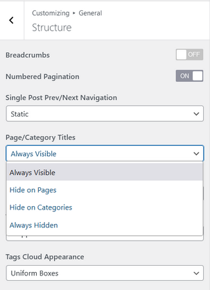
The page/category titles option is indeed not working as expected in the current Bravada release, thank you for pointing this out. We’ll have it sorted out in the next update.
And I can now see what you mean by absolutely massive, but that is so due to locally configured text size settings in the content itself:
So from the theme’s perspective, the content is appearing in the way you set it to appear (as local styling takes precedence over more general styling applied by the theme).
Hi Zed,
Thanks for your answer.
It works fine with the Twenty Twenty One Theme, I forgot to told you that I did tried that.
How can I deactivate all my plugins without injuring my website ?
Hi there,
There seems to be a problem with the theme on my homepage, all the text is squished to the right hand side and everything appears a lot smaller – all other pages seem to work it’s just the homepage.
And i tried a default theme and everything worked well on that so I’m not sure how the Bravada theme has managed to do this.
Hi,
thank you, I checked that but it still doesn’t work. I also tried setting the featured title image again bt the titles for the individual pages (only the posts) don’t display.
Website: hu.belrin/sts
ZedCryout Creations mastermind
Hi,
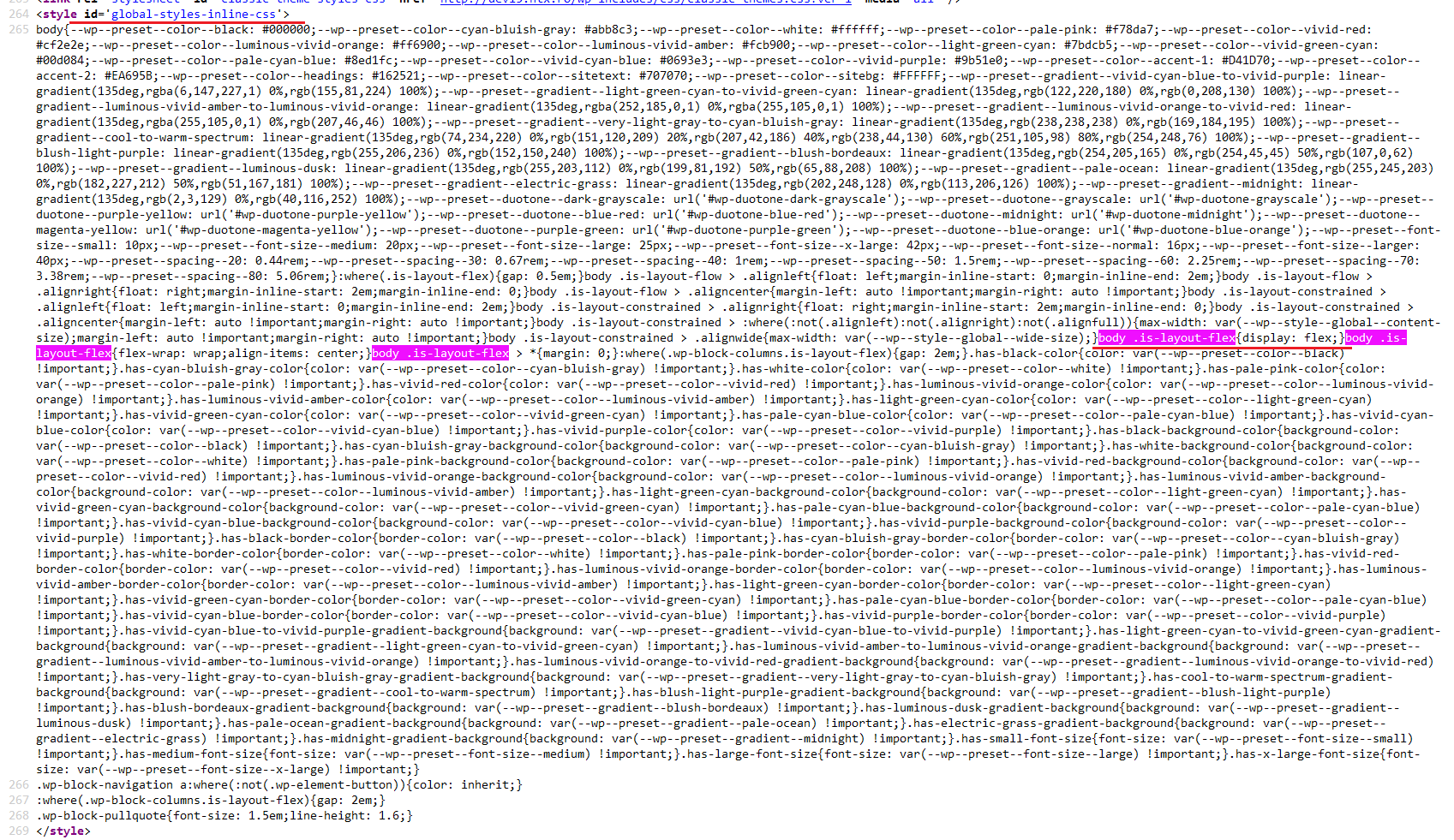
I cannot recreate this issue in Esotera on our test site (I didn’t check Kahuna). Comparing the markup and styling used by the galleries, I notice your sites are both missing some built-in WordPress styling that should be applied to the gallery elements (see screenshots below – first one is my test site, second and third are your sites, last image is the inline WordPress-generated styling from my test site that’s missing on yours).
I suggest temporarily switching to one of the default Twenty themes to check if the gallery works fine there. If it still doesn’t, look into any optimization plugins that may merge/minify the styling.

ZedCryout Creations mastermind
Hi,
The files you get access to with the purchase can be used on a site without any time limit or license dependency – using our Plus themes once purchased is not conditioned to having an active license with us.
However, access to new updates and the companion priority support service is conditioned to having an active license, that can be renewed yearly or less often, only as is needed.
I don’t believe in “lifetime” licenses. Those are, to say the least, a lie by omission – there is no such thing as “lifetime” in software, it should be called “software lifetime” for correctness.
Things always change, evolve, transform, stop being used or simply go away. No developer selling “lifetime” licenses will support or develop that particular piece of software for a person’s lifetime – maybe at most for the developer’s decided software’s lifetime, which means they can just stop supporting and maintaining the software at any point in time anyway.
Updates and maintenance also take time and effort, so charging for that in (optional) renewal instalments rather than all up front with the initial purchase can be lighter on the budget.
Socialising is way overrated anyway. Thank you for the earlier css, all the work you do and best wishes for the new year.
ZedCryout Creations mastermind
Hi,
The previous/next posts navigation has always linked to the chronologically (based on publish date) ordered posts relative to the currently viewed one. This never took other attributes (category/tags) into consideration.
In Bravada 1.0.7.1 we’ve adjusted this functionality slightly to limit the previous/next post links from the same (main) category (if it exists) as the post being viewed.
ZedCryout Creations mastermind
The option I pointed out in the documentation exists in all our themes and both the free and Plus editions:
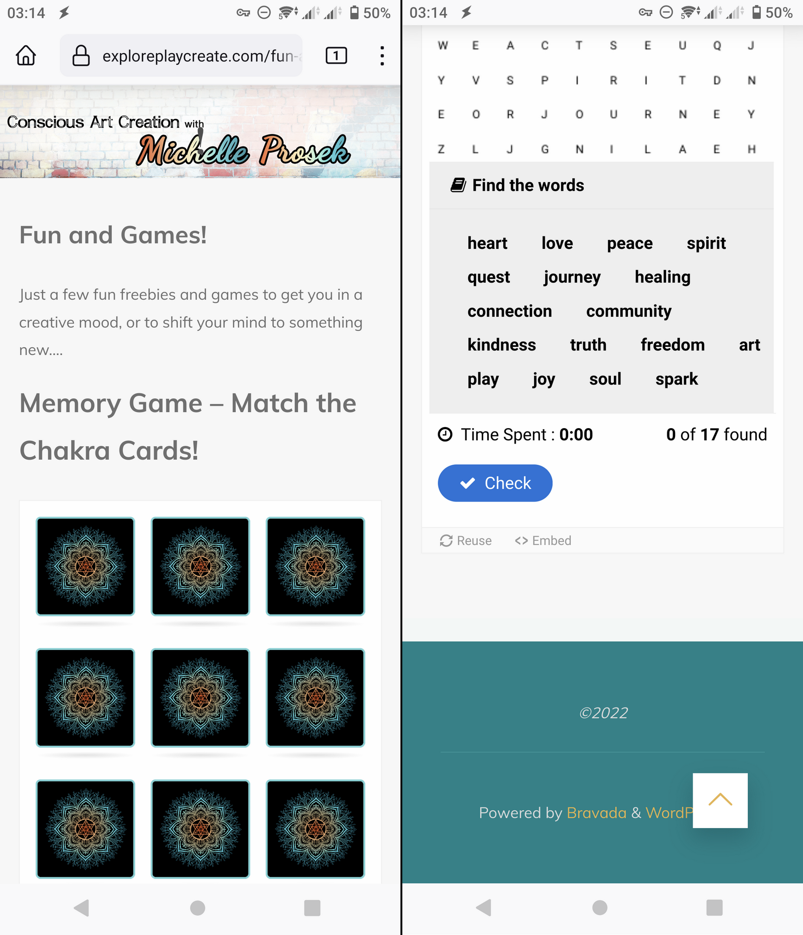
Below are screenshots with how I’m seeing the site on my Android phone and I’m not sure which text fits under the massive label:
Concerning the menus, Bravada includes two navigation areas in the header of the site:
- the main/side navigation, which is toggled into view using the hamburger icon and is displayed over the entire site. This menu is also used on mobile devices.
- the extra header navigation that is displayed inline with the site title/logo and hamburger icon. This menu is completely hidden on the smaller mobile devices and shouldn’t be used as the site’s only menu.
Okay…so by ‘dedicated theme option’, is that the upgraded Plus version of Bravada? Otherwise I’ve looked at the link in your reply and can’t find that anywhere on my current back end for editing the theme, unless I should go an edit the code.
Just want to verify before I pay to upgrade, although I only just started working with a new theme yesterday as I needed to make my site functional on mobile and had sort of lost hope on a reply here.
The Bravada version can still be seen at exploreplaycreate.com
The only other major issue is that the header and menu don’t show up in mobile unless you turn your phone horizontal, which most people won’t even think to do, plus all the text is absolutely massive (shouldn’t there be some responsive programming to make it suitable for mobile vs. desktop?). I’ve fiddled with text sizes in the actual pages and no change..it just looks ridiculous.
I’m using an android phone, but have had a friend with an iphone verify the same issues.
If you are able to look at the site on mobile you will see what I mean….I need the site to look good on a phone, and right now, it’s not so much….
Website: exploreplaycreate.com/fun-and-games
